
May 4, 2020
Organizations across the globe are dealing with massive change right now, including financial instability, shifting to remote workplaces and implementing new policies and procedures. The data that leaders rely on to make major decisions has never been more important and ensuring that data is communicated accurately depends on following best practices in data storytelling.
Digital Nova Scotia recently hosted a 3-part free webinar series called Data Storytelling, facilitated by Kevin D’Aguiar, from Matters of Data. Kevin led an engaging discussion that included tips and tricks for presenting data to stakeholders and decision-makers.
“When you’re presenting data, you want to influence your audience in some way,” Kevin explains. “You want them to change the way they perceive a subject, and potentially change their strategy. However, a change in attitude doesn’t come without some form of emotion. Data storytelling is the key to unlocking that emotion.”
What is a Data Scientist?
Kevin has worked in the field of data science for the past 21 years. In the webinar series, he shares that the skill sets needed for good data science actually require a team of individuals and are rarely found in a single person. He also says that the biggest gap he sees in most organizations between the data science teams and everyone else is a lack of good communication.
“Stakeholders will ask questions without the context of what data is available, and analysts will answer these questions with data tables and paragraphs of technical text that nobody understands,” says Kevin. “Nothing comes out of it.”
Kevin addresses the need for data scientists to improve their communication techniques, especially in presentations, where analysts are most often asked to share their results with a group of organizational stakeholders.
“There are many great approaches to telling a good story with data,” says Kevin. “One key concept that I like to use is to ‘steer’ the audience in the direction you want them to go by presenting in a clear and thorough manner.” Kevin adds that if a presentation is too vague, or there are gaps in the logic, the audience will fill them in with stories of their own. “And if their story doesn’t match yours, all could be lost,” he says.
Session 1: Foundational Components of Data Storytelling
In the first session of the series, Kevin covers the foundational components of good data storytelling and introduces a fantastic mantra:
“How do I minimize the time it takes for the stakeholder to ‘get it’”
This doesn’t mean to sacrifice quality for speed. Instead, Kevin lays out a specific list of components that help guide an audience to reach a desired conclusion as quickly as possible.
Voice and Elements of Style
- Logic: audiences need a logical argument to follow in order to believe the story you’re telling.
- Persuasion: if you’re not persuading the audience of something, you’re wasting everyone’s time.
- Story: a good story grabs the audience’s attention and adds meaning and context to the presentation.
- Graphics: reading is intensive for the brain, so graphics can be a quick way to confirm what you’re saying without competing for the audience’s attention.
Storytelling: You Need a Hero to Solve a Problem
- a hero: usually the stakeholder (not the presenter)
- a conflict: typically a business problem the hero is facing
- a goal: a way for the hero to win the conflict by defeating the problem
When these components have been well-executed, you offer solutions for the hero to defeat the problem, and data-driven proof about why those solutions will work.
Adding Data to the Story:
- the actual data
- insights from the data
- recommendations from the insights
While a presentation requires data, the audience will come to their own conclusions about the meaning of that data if you don’t include your insights and recommendations. The audience may even reach a conclusion that opposes your intended message if they aren’t given context around the data to steer them in the right direction.
Want to see the full session?
Download Slide Deck[fusion_separator style_type=”none” hide_on_mobile=”small-visibility,medium-visibility,large-visibility” class=”” id=”” sep_color=”” top_margin=”” bottom_margin=”25″ border_size=”” icon=”” icon_size=”” icon_circle=”” icon_circle_color=”” width=”” alignment=”center”][/fusion_separator]
Session 2: Application of Storytelling Components
In the second session, Kevin covers a list of Dos and Don’ts when designing a presentation, and provides us with some great advice on what types of visualization to use for different data scenarios.
Presentation Dos:
- Prevent competition for attention between visual elements and the narrated story
- Ensure visuals compliment your words, and vice versa
- Clean up data visualizations by getting rid of gridlines, avoiding 3D effects or shadows, and shortening numbers where appropriate
- Encourage your audience to remember, relate and decide
- Know your information and be prepared to answer questions
- Highlight key insights with visualization tactics that draw the eye naturally
- Use bullet point text, with a maximum or 2 or 3 bullets per slide
- Let your slides breathe
Presentation Don’ts:
- Present yourself as the hero instead of the stakeholder
- Add a lot of text to your slides to compete for the audience’s attention
- Try to build credibility through focusing on the amount of work you did
- Include information that’s unnecessary for the problem your hero must solve.
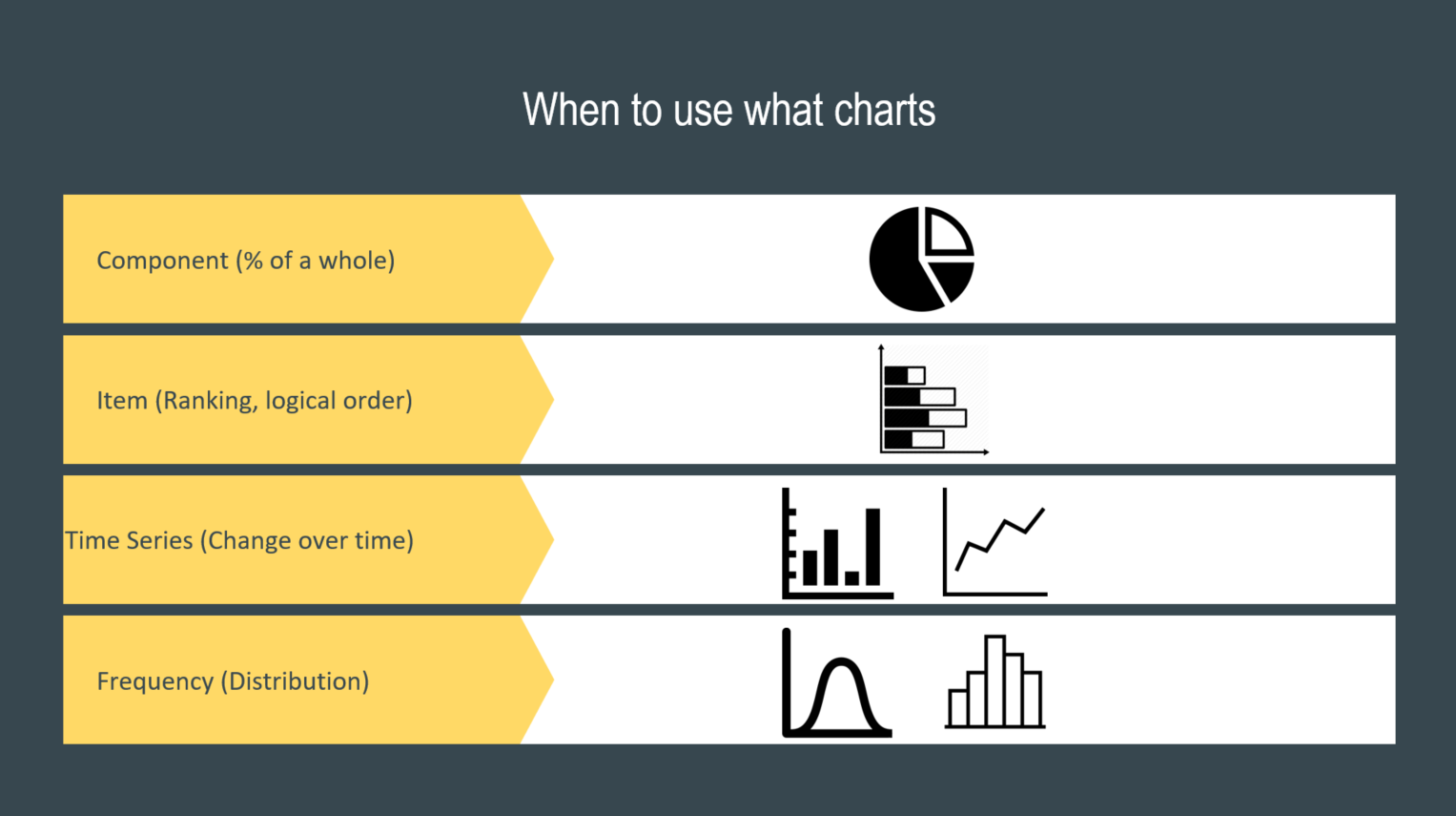
Adding Data Visualizations
The purpose of data visualizations in a presentation is to highlight key insights that your stakeholder heroes require to make the decision you’re steering them toward. Kevin provides the following chart, and while he stresses that these are only general guidelines and not hard and fast rules, it’s a useful tool for deciding how to visualize your data.
Want to see the full session?
Download Slide Deck[fusion_separator style_type=”none” hide_on_mobile=”small-visibility,medium-visibility,large-visibility” class=”” id=”” sep_color=”” top_margin=”” bottom_margin=”25″ border_size=”” icon=”” icon_size=”” icon_circle=”” icon_circle_color=”” width=”” alignment=”center”][/fusion_separator]
Session 3: Change Management Communication Techniques
In the third session, Kevin goes over some key tips for storytelling and a 2×2 grid model. He also covers methods to clearly communicate a new process, and skills for assuring buy-in from key stakeholders. “Changes only matter if they are adopted,” Kevin says.
2×2 Grid Model
This grid includes: the old way of doing something, the suggested new way of doing that thing, and then considers the positive and negative aspects of both scenarios.

Kevin says that the natural way for humans to present a change they want to make is to focus only the “old-bad” and “new-good” boxes and tell the audience, “the old way was bad, the new way is good, let’s do this.” Conversely, the natural way for a human to receive information about a change is actually the opposite: we tend to focus the “new-bad” box and the “old-good” box until we’ve bought in to the new process.
He says that the best way to communicate a change, and win over the audience to the new way of thinking, is to include all four boxes and present the information from the grid in the following order:
- Old-Bad
- New-Good
- New-Bad
- Old-Good
Everything should be included, and here’s the big reason why: If you leave out any single box from the grid, your audience will focus in on that section, get fixated on it, and you’ll lose buy-in. By starting with the “old-bad” box, you introduce the conflict for the hero to overcome. This keeps the audience engaged when you move into the “new-good” box, to explain how your change will allow the hero to solve the conflict. At this point in the story, the audience will naturally start to question whether or not the solution you’re proposing actually solves the problem. By addressing the “new-bad” box at this point, you can anticipate their concerns and focus on minimizing or offsetting them, using your data as proof. Finally, you visit the “old-good” box as an opportunity to point out specific elements that might be staying the same, highlighting that certain things the audience values will be preserved.
Kevin stresses the importance of demonstrating that you’re trying to understand the needs of the stakeholders and that their concerns are valuable in the process of deciding to make a change. He says that when it comes to change management, it’s important to keep the hero-goal-conflict model in the back of your mind as the driving force behind your strategy. By making your stakeholders, or your audience, the heroes of the data story, they will be more likely to perceive the change positively and be more motivated to follow through with it.
Want to see the full session?
Download Slide Deck[fusion_separator style_type=”none” hide_on_mobile=”small-visibility,medium-visibility,large-visibility” class=”” id=”” sep_color=”” top_margin=”” bottom_margin=”25″ border_size=”” icon=”” icon_size=”” icon_circle=”” icon_circle_color=”” width=”” alignment=”center”][/fusion_separator]